QESTIONS AND ANSWERS
group 1: your UI seems to require a learning curve. But it basically adds 2 levels of logical AND and logical OR. Do you thing this could be done easier? Besides, mainly how do you know with filters to apply to begin with?
This is a great question! You say we could have done this in an easier way.. maybe but we wouldn't have reached this level of flexibility and powerful filter compositions. In the presentation we didn't show you all the features, but with our filter box interface you not only have OR and AND, you can create arbitrary filter sequences, compose them, merge them and use multiple outputs at different level. Not only this, we can specify for each box if we want to include synonyms, or invert (negate) that block. In our opinion, no other interface would have let us do this with this degree of flexibility.
This tool was particularly useful in the exploration phase of the project, searching for clues, events etc.. What you saw today was a simplified version because we already knew the answers that we wanted to show.
|
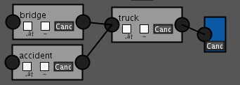
group 2: in your example of filter choices, are the nodes bridge, tuck and accident connected in a way that allows a user to search for this text combination? (question is about logical structure of filter)
Yes, they are. The system will produce a query of the type "bridge" OR "accident" AND "truck", so all the tweets containing the word truck and at least one of the words bridge and accident will be fetched. This happens because the output filter is connected to the "truck" box, which is in series with the parallel of the boxes "bridge" and "accident". |
|
group 3: When considering lines on the map, did you think about showing the direction of movement? I the direction repeats over time it could mean a daily commute and could be removed.
To see if movements are for daily commutes what counts most is not direction (that would simply alternate in every case) but how often two places are connected and at which frequency. We decided to process the data so that only those people with a certain mean travel distance would show up, so as to avoid people remaining too stationary. This cleaned the data a lot. Besides, we did want to know about commuting (this was our main interest in fact) because it could be a cause of the spreading of the diseases.
group 4: How does your application justify that the outbreak was caused by truck accident and not by an explosion in smogtown area which is close to the river? Also, what about the possibility of people-to-people outbreak due to convention bell in uptown?
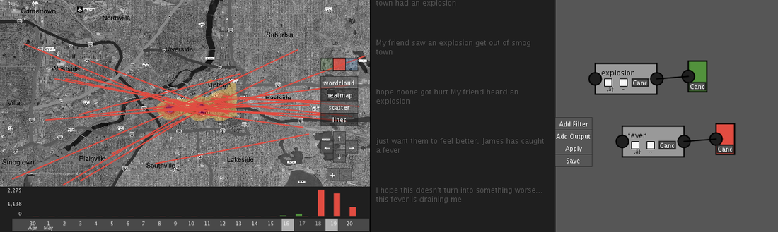
The fact that the characterization of an epidemic spread originates from the truck accident can be simply shown by the on map scatter plot, taking advantage of the color coded filters.
The fact that the characterization of an epidemic spread originates from the truck accident can be simply shown by the on map scatter plot, taking advantage of the color coded filters.
The above picture clearly shows that the airborne takes origins in downtown, next to the place where the truck accident happened. On the other hand, there is not a spatial relation between the Smogtown explosion and the people starting getting sick.
This simple justification can be strengthen with three more considerations:
This simple justification can be strengthen with three more considerations:
- The wind is directed from west to east, and in theory downtown could marginally be on the path of a so generated airborne. However, there is no trace of messages from sick people from somgtown to downtown, so the outbreak cannot be characterized in this way.
- Similarly, the river flows from north to south, so it could not carry spores to downtown. Furthermore there is no trace of messages from hill people from the explosion to downtown following the river, while there is in the opposite direction regarding the gastrointestinal outbreak.
- Last, as it is shown in the picture below, there is not a relevant path of sick people going from smogtown to downtown in that time interval. So we wouldn't go for a people-to-people outbreak
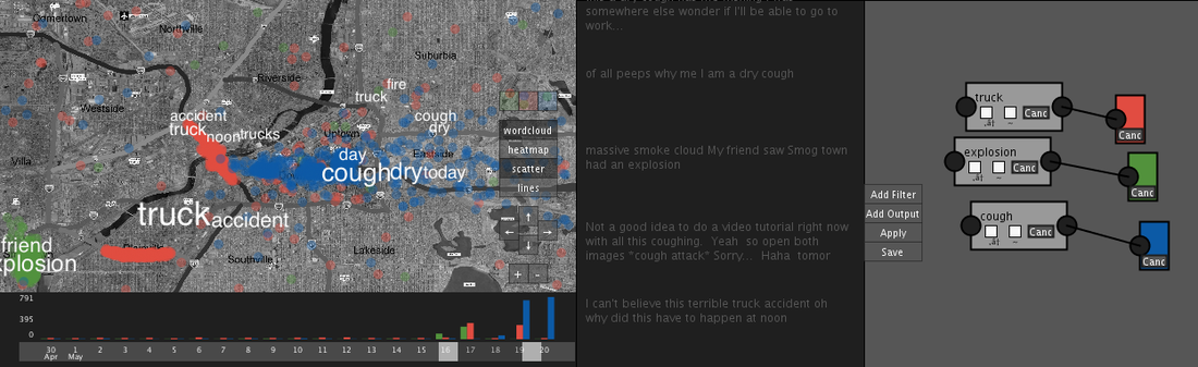
group 5: Your mapping of data was very original (heat map, lines, overlay of words) where did you look for ideas to do this design?
Thanks, the design was partly inspired by other similar projects/tools we saw online, and in part to the need that arose during the exploration phase. For example, we realized the need for the line overlay only after having some doubts about the movement of the users related to the cough outbreak, and implementing this tool was useful to determine that it was not caused by commuting of people. Not only this, we found interesting facts, such as people going to the hospital and how their movement spread the outbreak in small and well defined clusters in the suburbs.
group 7: why are weather information show only on demand? Wouldn't be better, w.r.t. seeing weather related patterns, to have them always on sight?
We thought about the possibility, and actually in a first draft we had the weather information as a layer on the map. We then realized that this was too intrusive, and also confusing if the users wanted to analyze a larger time interval on the map. The current solution is more effective, and quick to use: simply touch the day barchart and scroll with your finger to quickly see how the weather evolves in time.
