About the Tool
When the Wind Blows is an effective tool to visualize the characterization of an epidemic spread following tweets rumors.
The goal of this project is to create a tool which allows easily and effectively to go through and investigate the data. The solution to the problem is known, our goal is to show that the given solution is the best match for the data and that the other possible causes are less likely. People are getting sick, why? Is it an accident or a criminal / terrorist act? Is it a truck crash, or a plane crash, or a gas line explosion or a bomb or just a normal flu outbreak?
The goal of this project is to create a tool which allows easily and effectively to go through and investigate the data. The solution to the problem is known, our goal is to show that the given solution is the best match for the data and that the other possible causes are less likely. People are getting sick, why? Is it an accident or a criminal / terrorist act? Is it a truck crash, or a plane crash, or a gas line explosion or a bomb or just a normal flu outbreak?
Functionalities
|
|
Map

The map is the main component of the program. Basic functions such as zooming and panning can be performed. It also allows to perform different type explorations on data to analyze them.
Standard operation such as zooming and panning are available.
The provided exploration functionalities are four:
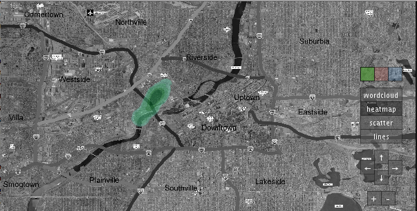
Heat Map
The heat map is a graphical representation of data where the individual values are grouped together to identify specific areas of interest, where the density is represented as the fade of the color (more intens means more dense). The basic color of the heat map corresponds to the one of the filter associated to the map.
Standard operation such as zooming and panning are available.
The provided exploration functionalities are four:
Heat Map
The heat map is a graphical representation of data where the individual values are grouped together to identify specific areas of interest, where the density is represented as the fade of the color (more intens means more dense). The basic color of the heat map corresponds to the one of the filter associated to the map.
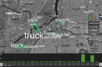
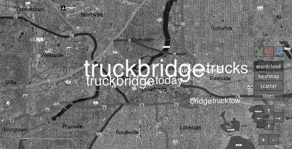
Word Cloud
The picture below is an example of the word cloud. The word cloud is built over the real geographical position of the tweets containing the word displayed. The visualization changes dynamically when the map is panned or zoomed.
The picture below is an example of the word cloud. The word cloud is built over the real geographical position of the tweets containing the word displayed. The visualization changes dynamically when the map is panned or zoomed.
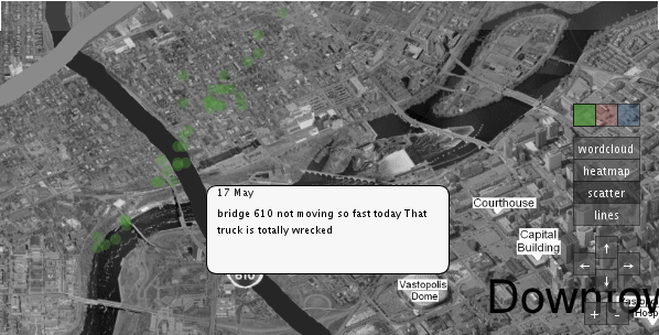
Scatter
Each point of the scatter represent that a tweet has been composed in that geographical position. Pressing a scatter point prompt up a tool tip displaying the details of the tweet. Again, the color of the dots match the color of the filter.
Each point of the scatter represent that a tweet has been composed in that geographical position. Pressing a scatter point prompt up a tool tip displaying the details of the tweet. Again, the color of the dots match the color of the filter.
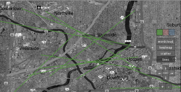
Lines
This visualization join with lines all the tweets corresponding to the same user. This tool is usefull to track user-specific conversations.
This visualization join with lines all the tweets corresponding to the same user. This tool is usefull to track user-specific conversations.
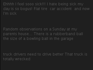
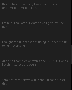
Tweets
In the central part of the application is present an area displaying with an animation all the text of the tweets matching the last filter applied. This can be useful to see wether the filter applied is significan or not.
Filters
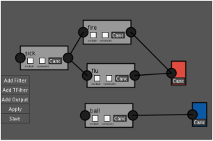
The right-most side of the application is left to to filters. Filters can be added, dragged and removed from the area. Each non-terminal filter (in gray) contains a word that can be edited by the use of the keyboard appearing when such box is pressed. Two check boxes allow users to exclude the word in the filter, or include all the word synonyms. Boxes can be linked by the use of the big dots at the boxes edges. Terminal boxes (green, red and blue) can be added in order to pick up all the filter chain ending with the box. Filters in parallel are in OR, filters in series are in AND.
